This week I wanted to talk about my work a bit more but didn't know where to start. After looking at all my recent work I thought that since I was doing a lot of type and lettering pieces that I should talk a bit more in-depth about that and how I get from sketches to the finished pieces. I also thought it would be nice to show some of the sketches that I do on paper before I move on screen so you can see a bit more into my process and how I work.
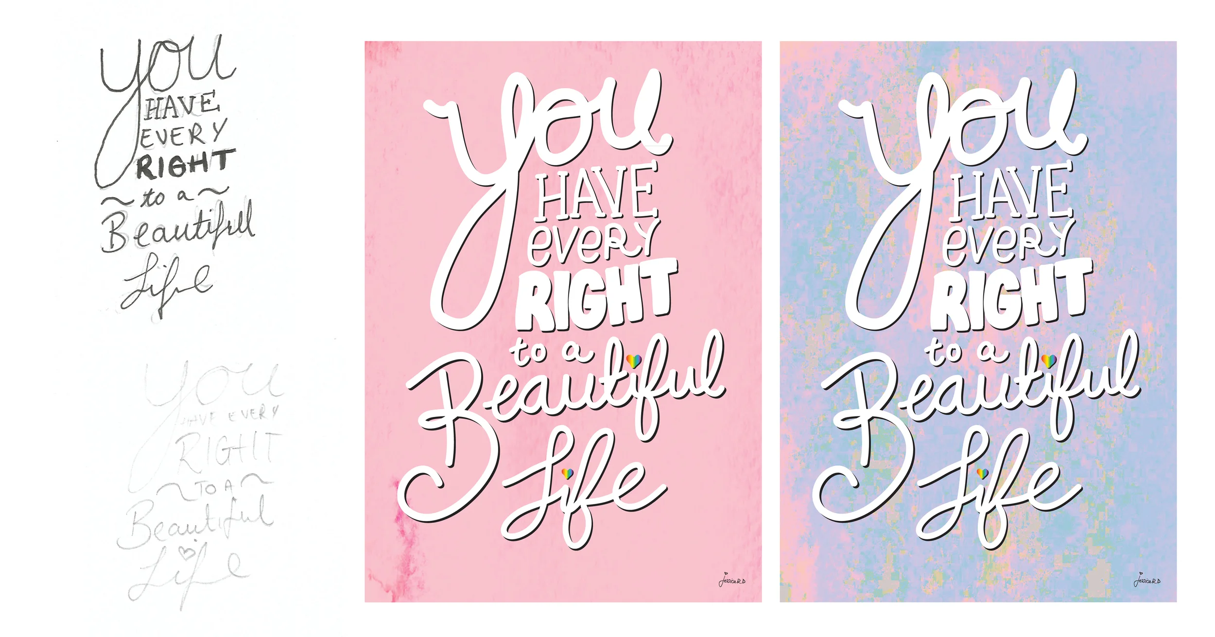
Sketches that we're used and the final piece.
Firstly I usually do a few tiny sketches so I can look at type layout and the placement of the words, and then i'll find one I really like and work that up on a larger scales so I can get a good feel of how it's going to look. After that I'll probably decide the shapes of the lettering and how I want them to look, such as squiggly lines, thick bubbles, signature style, etc. This usually changes depending on how it ends up looking on screen but usually I end up sticking to the way i've sketched it all out.
When the hand drawn sketch is finally at a point where I like it then i'll scan it in and place it on a layer on my file on Illustrator. I'll usually lock this as a layer and use it as a sort of guide for the digital drawing. Then using my Wacom Bamboo drawing pad I'll start drawing the digital letters. I really love this drawing pad as it's so much easier than using a mouse or trackpad for getting the shape of the lettering that you want. And especially for the attached hand writing, because it's so easy to get a good flow to the whole word when you're using a stylus pen. I'll usually draw and re-draw it a few times until i'm completely happy with the shape of the design and the letters. Then I'll clean up any mistakes or lines I didn't mean to do. After that's all done, I'll start playing around with the colour of the lettering and different added features such as lines and dots. Then i'll print it out, if it's going to end up being a printed piece, just so I can see how it will look and how all the colours look together, and if I need to change anything.
This is the process I use for most of my lettering pieces, but some differ as sometimes I use illustration pieces with the digital lettering, or sometimes I'll want a less digital looking style to the piece so I'll do it all by hand on paper (usually in acrylic paint, a 0.5mm Muji pen, ink and a paintbrush or with an On The Run:202 Luxusliner with a fine tip), scan it in and work with the hand drawn piece till i'm happy with it and then play around with the colour. I'll talk in more detail about the specific products I love to use in another blog post soon!
This is a little gif to show you how the piece looks on paper compared to how the finished piece turned out.
Hope this puts a good perspective on how I get from point A to point B when creating lettering pieces, and hopefully inspires or helps you if and when you are creating your own lettering piece. All the finished lettering pieces can be found in the lettering section on my website.
Enjoy your week,
Jess x


